Tiny Stones


3) small sable or natural hair good artists brushes, I use #0, #00 round, #0 flat(rarely), an old broken-bristle small brush to get feather/fur effect ( this could be a cheap child's water color brush actually), and a very small liner.
7) 24 gauge or 22 gauge steel wire or gold-colored wire
8) small needle-nose pliers (jewelry repair size)
9) small wire clippers
10) E6000 glue and toothpicks to apply with
11) hat pin or metal dental pick
13) wipe rag [Free], maybe a used toothbrush for cleaning stones [Free]
14) clear acrylic enamel spray* or clear floor coat made for terrazzo.
15) optional...around-the-neck magnifier. I don’t use one but you may want to. Remember, when worn, few folks are going to come up to the wearer of the jewelry with a magnifying glass.
MAKING AND ATTACHING BAILS- I have done this step last but now think it is best to apply the hand-made bail to the stone before painting. To make a bail, cut a piece of wire with the wire clippers anywhere from 4-8 cms long, depending on the stone. Take one very tip end in the tip of the jewelry pliers with your right hand (if you are left-handed, reverse these directions) and make a tight “hook” in the end, as small as you can. Keeping the hook in the pliers sort of loosely, use the index finger of your left hand to push against the hook while you rotate the coil with your right hand with the pliers. This will make a beginning coil. For these small stones, I make two complete circles, one outside the other. Now repeat on the other end. You should now have a straight wire with a coil on each end. Wire is forgiving so you can re-bend to make it neat. But do remember, these are just stones so perfection isn’t required in the bail. Next, place one coil on the “front” of the stone (you establish what is front) and slowly bend the other coil to meet the back of the stone. It doesn’t matter in which direction the coils are facing. You may want to put a bend in the bail first. It should go backward from the front coil so that the coils are perpendicular to the curve of the bail. Now you have a 3-D “u” shape. When the coils sit flush one on either side, remove the bail and push together slightly, making the span shorter WITHOUT distorting the shape of the bail any other way. This ensures a tighter fit. Apply glue (E6000) to each coil and fit on stone, making sure you leave enough room at top for painting and also for clearance to fit a necklace chain through.. You may have to hold or brace the bail for a few minutes so it doesn’t slide around. Allow to dry for AT LEAST 72 hours. Some stones are so irregular that you will find that placement of a bail difficult. You may have to squeeze the bail in place before gluing to conform to the stones shape. You can also glue the bail to either side of the stone or both coils flat to the back. In which case, you will not bend the bail in the same direction but parallel to the coils, making a flat “u”.
DECIDING ON A SUBJECT AND UNDER-PAINTING- Look for sources of drawings of the subject you want to paint. This can be from books, internet pictures, cards, life or anything else. I find drawings are easier for me to follow than photographs. If the stone had a shape in it, try to follow that and not “fight the stone”; especially if it is a rough textured stone. Don’t make things harder on yourself than necessary. Using white acrylic paint, just get the filled-in outline on the stone (reverse silhouette). If you make a minor mistake or it doesn’t quite look right; use that hat pin or pick and scrape away what doesn’t look right (you can even try a drop of water before scraping , but don’t over do it or you’ll “erase’ the good stuff too) or add a little paint with a liner. You can try to dampen a tiny corner of the wipe rag and gently try to erase what you don’t like then refill what you need. When the “reverse silhouette” is like you want it, it won’t take a minute to dry. If it just looks terrible; I plunk it into the rinse bucket for awhile and scrub it clean and start again. I don’t know if any of you would be adept enough (I surely wouldn’t) to make a small enough stencil of the subject but you could try. I think the stone surface will prevent a good transfer anyway. So you are kind of on your own. It just takes practice on one kind of subject to get the feel of the overall shape. I am not a very good draftsman so I know. And I’m right/left dyslexic so if my reference pix is facing right, it is extremely difficult for me to not only reverse the silhouette but to get the color patterns in the correct position. Plants are lots easier than animals since they can basically bend any way, but the shape of leaves and blossoms need to be recognizable. I’d suggest starting with some subject you are really familiar with looking at. The key for me is to add and subtract to that silhouette until I get it where I want it. You can’t do that as well on canvas. Acrylics on stones are “erasable” so easily!
PAINTING- Now you are ready to apply color. Study the picture you are using for reference and try to match the paint to it, mixing as needed on the “palette” but only use a tiny drop of each paint. You’ll be surprised at how little paint you need. Sometimes it only takes a tiny tip end of the liner brush with a dot of paint on it (esp. black which is intense) to mix. Be aware that acrylic, especially in this small quantity dries VERY QUICKLY so you need to preplan all the places that particular color goes on the subject. It might even be an under-color over which you’ll put dots or dashes for details. Use one color at a time. If you mix too much, can you apply it to another stone subject? I always have 5-10 stones in front of me with silhouettes on them at this stage. You can also use a watered down color for a wash but here again be very careful to apply the tiniest amount or it will go everywhere. I also find it helpful when watering down a color to be sure and rag off any water on the handle or ferrule. When going from color to color, never dip one color into another, do all mixing on a palette. Rinse your brush thoroughly between each color you are applying to the stone.I can’t tell you how to paint, that is an individual gift or skill. But these stones lend themselves to most styles including one-stroke and primitive and realistic and all in-between. Acrylic paint is so forgiving. You can go back over and over what you don’t like. For me, hardest after the basic shape, is the eye of a bird. I need to see where the placement is on the head (not the same for all birds but basically close) and to see if there is a ring of color around the iris. If so, I paint a small circle of that color. Let it dry; go back with a black, yellow, red or yellow iris (depending on species) and let that dry. Now the hardest part...the “spark of life” or that tiny white or light gray reflection on the iris that lets you know this is a living thing. Here’s where you really do have to use a liner with a very sharp point. I always “point” my brush before this step. Yes, I pull it through my moistened lips for that. Just barely touch the tip to the white or light gray, getting the least amount on you can but you have to hurry or the acrylic will dry right on the tip before you even get it to the iris. Any bigger blob and it will look bad and staring. Check out where these reflections are painted in your references. The great thing is, if you make a mistake you can go over it to fix it. Sometimes a nudge at one side with iris color again can fix it. Sometimes you have to start all over again with the iris and back to the highlight. Persevere; this is the very essence of your painting. The same for flowers, where does the light hit the petals and leaves? Maybe not as tiny to do, but essential.


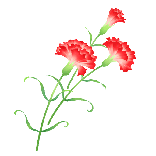
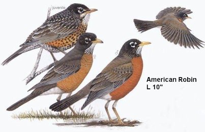
Since Mother’s Day is coming up let me talk you through 2 examples; Carnation and American Robin. Get a colored drawing in front of you (from Internet maybe).
Carnation: the bloom should be toward the top 1/4 to 1/3 of the stone and positioned with the bail in mind. All carnations have a fat green “V” in 4 sepals(sections) cupping the bottom of the blossom. With the bloom in mind, using white under-painting and a small round brush, paint this in first. Then a single slightly curved stem from the base of that to the bottom of the stone or nearly. Carnation leaves are long and thin so you can position them now but you’re only going to suggest them in the final work so don’t worry. You may want to leave room along one side of the stem to later write the word “MOTHER” along that stem. Look at your drawing, which direction do the petals face? How many approximately? Not all are shaped the same or the same size. White under-paint those in. If you’re doing a white carnation, you’ll be half way there.. This is the time to ruffle the edges on a white one. You’ll do it later for colored ones, unless you want the color edged in white which can be very effective. Then ruffle now, color later.. Using a scruffed up end of brush, dip just the end into the paint, consistency as it comes from the bottle, and on the palette, dab off most of the paint vigorously as you would for stenciling. Now place the brush about 1mm from what you think will be the edge of a petal, press hard against the stone and push upward. This should give you a ragged edging. Practice first on the palette while I start the “robin folks” off. Do this to any petals you think are outstanding. This step you’ll do with the color phase if your carnation is other than white. You’re doing just fine.
American Robin: You’ll be using white as the under-painting to get a reverse silhouette of the robin. Birds are basically 4 shapes- honest! Head is a circle to start with, body an oval, tail a long rectangle and wings...well, study your drawing for shape and size to body.
Here's an idea for a stone, decoupage the print behind the painted head.
Beaks are specialized to different birds and can identify them so study the bird’s beak you are painting carefully for size and shape and position to front of the head. Birds generally need to have negative space on the stone around them (unless you are doing a “natural”), so “eyeball” size from that and the bail position. Tail end and round head need to be sized so they fit on the stone. A dot of paint each point could help you visualize the size you need to paint. Now to drawing. The steps are basically the same for standing or flying birds, refer to your color drawing reference.Under-paint the tail and round head to position the bird and “size” it. Standing the tail is lower than the back, and flying the tail will be relatively in line with the back. Next, do the beak using reference. Till you get what you need. Is it fat; skinny, short, long, straight, curved? Place it where your reference shows you it goes on the robin, beak is relatively medium length straight and not too thin. Now, using reference, is the chin curved back/down or a straight angle down/back? Does the top of the neck curve in or appear almost straight to back? Under-paint those tiny spaces. Now under-paint the oval body to connect to the neck. I can’t use the “B” word here on the boards, so the “front of the oval” will have to do for the upper front of the bird above the belly. It is critical to the look of your bird’s look. Is it too skinny? Gradually, nind you, add a little at a time to make it fuller and rounder. Too fat? Use that wonderful hat pin and gradually scrape a tiny line away at the edge till you get the look your reference shows you. Add a touch, shave and sliver a bit...acrylic lets you play till you get things as you want them! Back of the belly and before the tail is a very important little triangle called the vent. It is very often a different color on birds pattern. So under-paint that now using reference to attach it to tail. Did you choose the robin standing or flying? A bird’s wing starts from a rounded shoulder shape at side of oval; go ahead and under-paint that round shape even though you may not necessarily see it on the oval. It will help you “feel” the shape of the wing on the bird. Now you have yet another decision to make. Standing, the wing is a long thin triangle with tip toward tail. Do you want the tip above the tail or below? Flying, you’ll need to use a reference for shape and position of wings for each bird. A robin’s wings in flight are sort of rounded toward tail curving in toward body at end and more pointed toward head end. You’re “rocking robin” right along now, good job. I’ll be back after I talk to the “carnation folk” so study the color pattern of the robin on your color drawing reference.
Carnation: Now look again at the drawing and see where the shading is. Try to copy that onto your carnation. Most of it will be lower on the bloom and underneath petals. For a white carnation, you can simulate petal edges with tiny dots of gray paint along the edge of where the petal looks to be or you can use that scruffy brush and “wiggle” edges in. For colored ones, use a darker shade of the base color of the carnation. Fill in the green of stem and leaves and sepals etc. with liner brush or thin pointed end of brush. Now fill in the color of the carnation (if not white) right over the under-painting, mix a little darker shade and use it as above where gray is shading. You’re almost done. Heave a huge sigh. Finally using fine line pen, write “MOTHER” along one side of the stem in tiny letters. You’re doing just great. Now you “rock on” while I go back to the robin folk”. Or go on to “finishing”
American Robin: Wow, you did a wonderful job on all that. Now for the color over the white. American Robin needs a Slate Gray Brown head. Using your reference, place a white dot where eye will be, large enough for the pupil later but still in proportion to head. Now go back with white and dot in the eye-line above and below the ”eye” and toward the beak. If you place eye and beak differently on round head you will get “attitude”. Leave the head now. Using white, redo throat if needed. The upper belly and chest are a rust orange, if in flight, there is orange on the underwing too, see reference. Leave lower belly and vent and top of leg feathers white. Paint back and wings a lighter dark brown than the head. Go back with white or light gray and streak wings for feathers, see reference. Paint legs and beak yellow. Take just the tip of the liner into black and finely streak throat and head/neck margin; put in black pupil leaving a tiny margin of white (not all birds have this but most do).. You might break up that white eye-ring at this time if it isn’t already; streak tail and wings with black now and maybe if you’re really good with tiny details, make the toenails black. Last, go back with white or light gray and work on that “spark of life”. Sometimes I push a smudge of color at back upper part of circle, sometimes a tiny dot of “life” there. Again, acrylic is so forgiving. Keep placing black then spark until you get it the way you want it. Another tip is to use the black to nudge into a too large white dot. Got it? Fantastic, you’re done! Heave your sigh of relief.
As for the "naturals" I paint, a lot of times it seems it is the outline of a head (like the tiger head I painted my DGD) or of birds. So I generally under paint the whole stone in that case. That's one reason why I included that robin's head drawing reference above. They most often are more "prim" in style just because of the shape of the stone. So you are generally "suggesting". The color patterns and details could be (but don't have to be) less detailed. Just so someone can tell it's a No. Cardinal and not a Summer Tanager; a Blue Jay and not a Bluebird. I'm hoping some of you are staying in "class" and are working on a stone. But if you all are correspondence students, that's fine too. Hope all this helps.Incredible easy to understand instructions. I will have to save these as I have so many projects going right now I need to finish something completely before I add one more.


Anyway, Thank you so much for the class. I truly appreciate all of the time and effort you put into putting this on here for us.You're amazing!
Mamo
*DO NOT take photos/directions from this site and post elsewhere without permission from the author!! You may link to this site, but please don't take credit for another person's work. ALL lessons are the author's copyrighted property and not intended for mass marketing.
Thank you, & have fun crafting!

